Platform feature · ECE software
PC Online Custom Reporting
The reporting tool didn't just make reports easier. It made the platform trustworthy.
The 55-second version
Users downloaded two CSVs, manually combined them in Excel to find the one column they needed — and couldn't use Excel at all without a paid subscription they shouldn't have needed.
A full report builder with drag and drop, live in-app preview, custom templates, internal sharing, and universal CSV export. Built in three phases over a year.
A customer told me directly: "I shouldn't have to pay for another subscription just to read my own data." That one sentence changed the export format for the entire platform.
The only major feature shipped by end of year. Company-wide excitement — especially from sales and implementation, who had been waiting for this for a long time.
The before state
A workflow that was quietly failing people
Before this tool existed, getting a custom financial report meant reading descriptions to guess which report had the data you needed, downloading it, downloading a second one, opening Excel, and manually combining them — hoping the columns lined up. If they didn't, you started over.
Users weren't failing at reporting. The platform was failing them. They had built their own system around a tool that couldn't do what they needed, and nobody had named it until a customer said it directly.
"I shouldn't have to pay for another subscription just to read my own data."
That wasn't a feature request. That was a trust problem. The platform was exporting data in a format that required a paid Microsoft product to open — quietly excluding every customer who didn't have that subscription. We changed the export format to universal CSV. The backend work was harder than expected. It was completely worth it.
Testing
Where familiarity beat novelty
Building this net new meant nothing had established patterns yet — so small decisions mattered more than they should have. We tracked it in Pendo: task completion time, discoverability, error rate on core actions like export. The clearest example was the export button.
A cleaner icon would have reduced clutter on the page. But this software had years of muscle memory built into it, and customers went looking for export exactly where it had always lived. Every time we tested the new icon, discoverability dropped and task completion slowed — a real cost in a workflow people relied on daily. I kept the button where they expected it, even though it wasn't the tidier choice. Familiarity beat novelty, and the data backed that up every time we tested it.
Approach
Shipping in phases — not waiting for perfect
A full report builder from scratch is a year of work. Shipping nothing for a year while building it wasn't an option. So we broke it into three distinct phases, each one useful on its own.
UI refresh — restructure and simplify
The existing reports section was overwhelming. Endless scroll, no clear hierarchy, no way to find what you needed quickly. Phase one was about making the foundation solid — restructured the page, reduced cognitive load, and gave users a clear mental model before we added anything new.
Favorites — built directly from what users told us
Customers consistently told us they ran 2–3 reports regularly and maybe a couple more once a month. That was the whole pattern. So we built exactly that: a favorites section front and center so the reports you actually use are the first thing you see. No hunting. Customers were genuinely happy when this shipped — which confirmed we'd been listening to the right thing.
Custom report builder — the year-long lift
Drag and drop interface. Live in-app preview before exporting — so you could see exactly what you'd get without having to generate and download first. Custom templates you could name, rename, and share internally. Universal CSV export. This was the feature the whole project was building toward, and it was the only major feature the company shipped by end of year.
Screens & prototypes
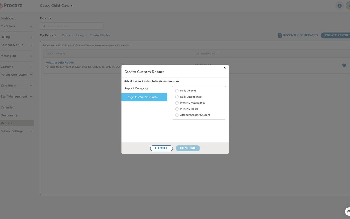 Create Custom Report — category selection
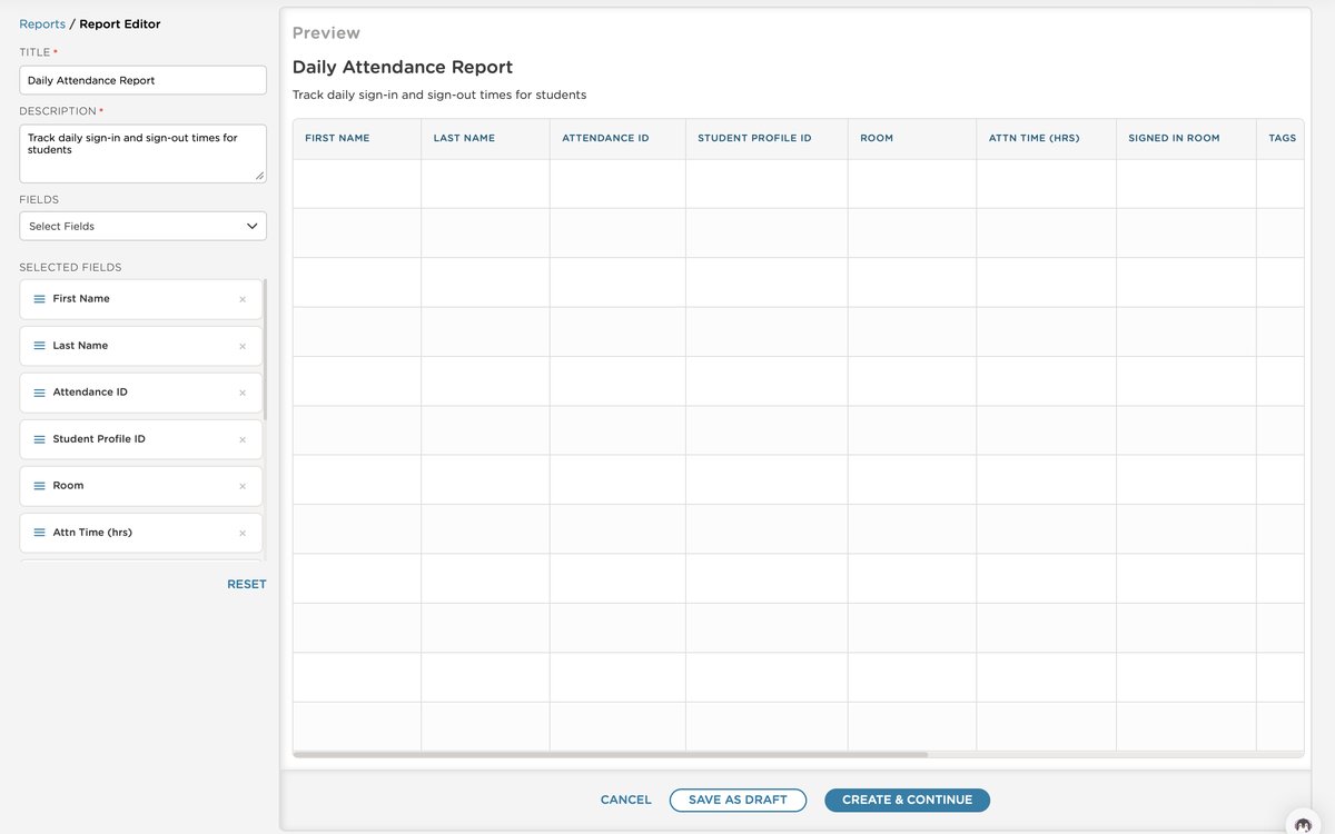 Report Editor — field selection, live preview
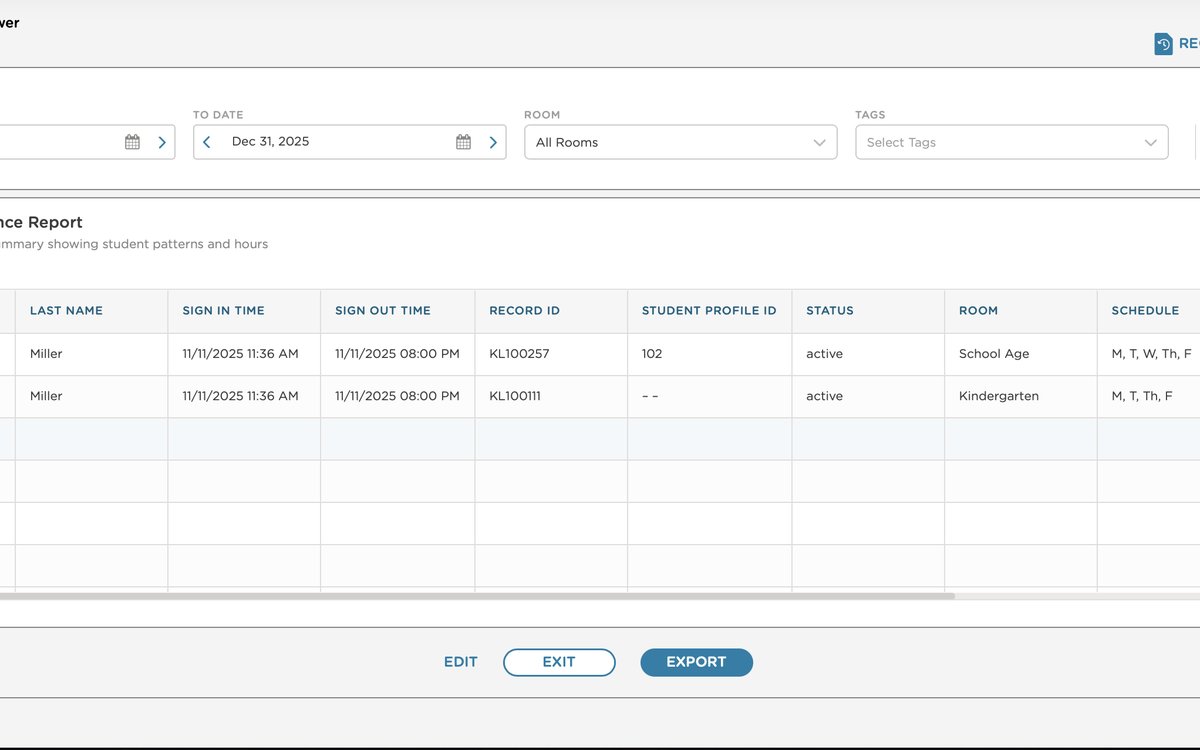 Report Viewer — populated data with export
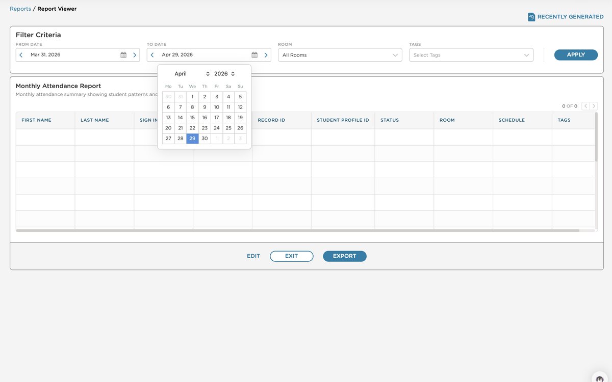 Filter criteria — date range picker
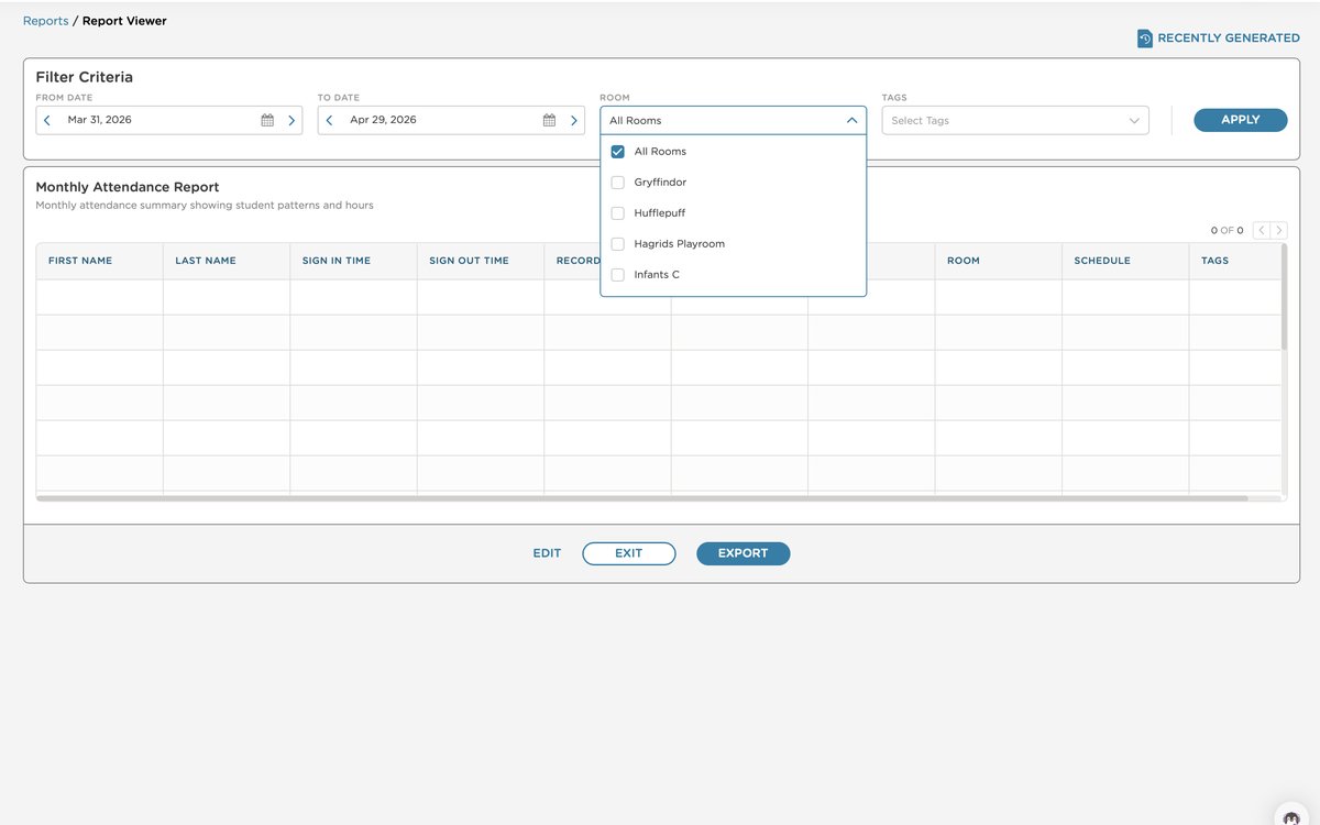 Filter criteria — room multi-select
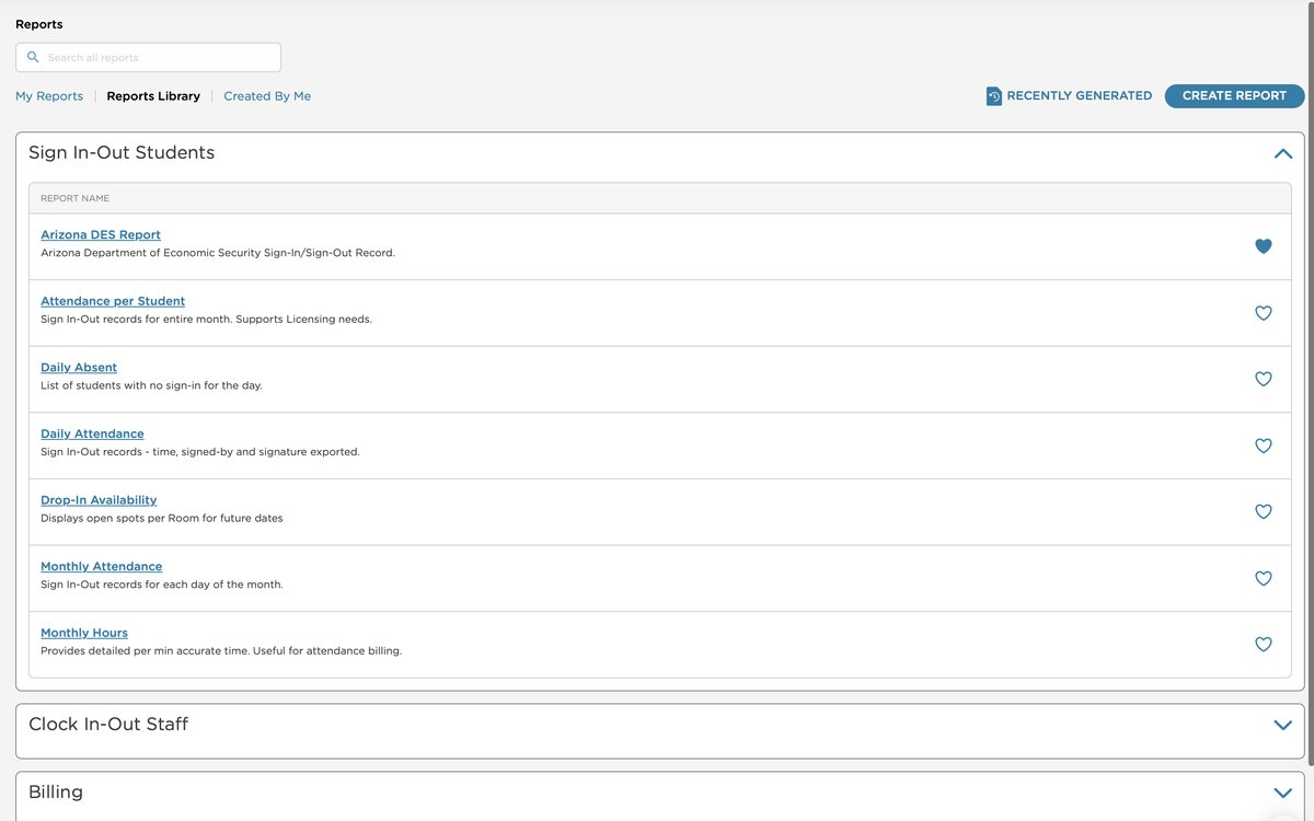 Reports Library — categorized browsing
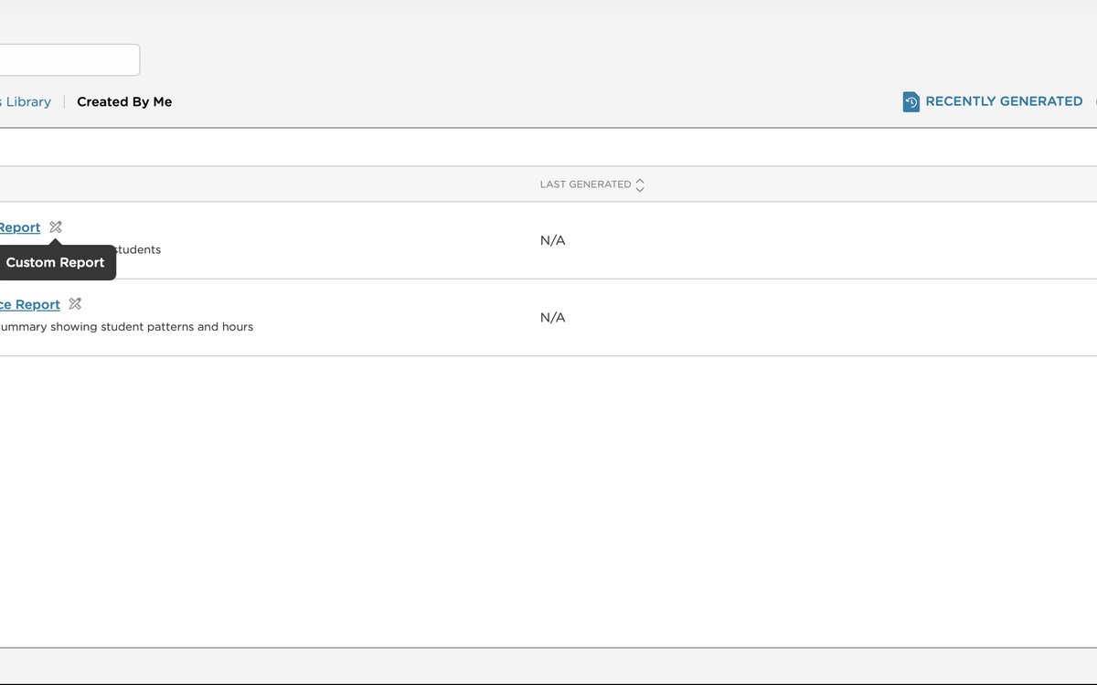 Created By Me — saved custom reports
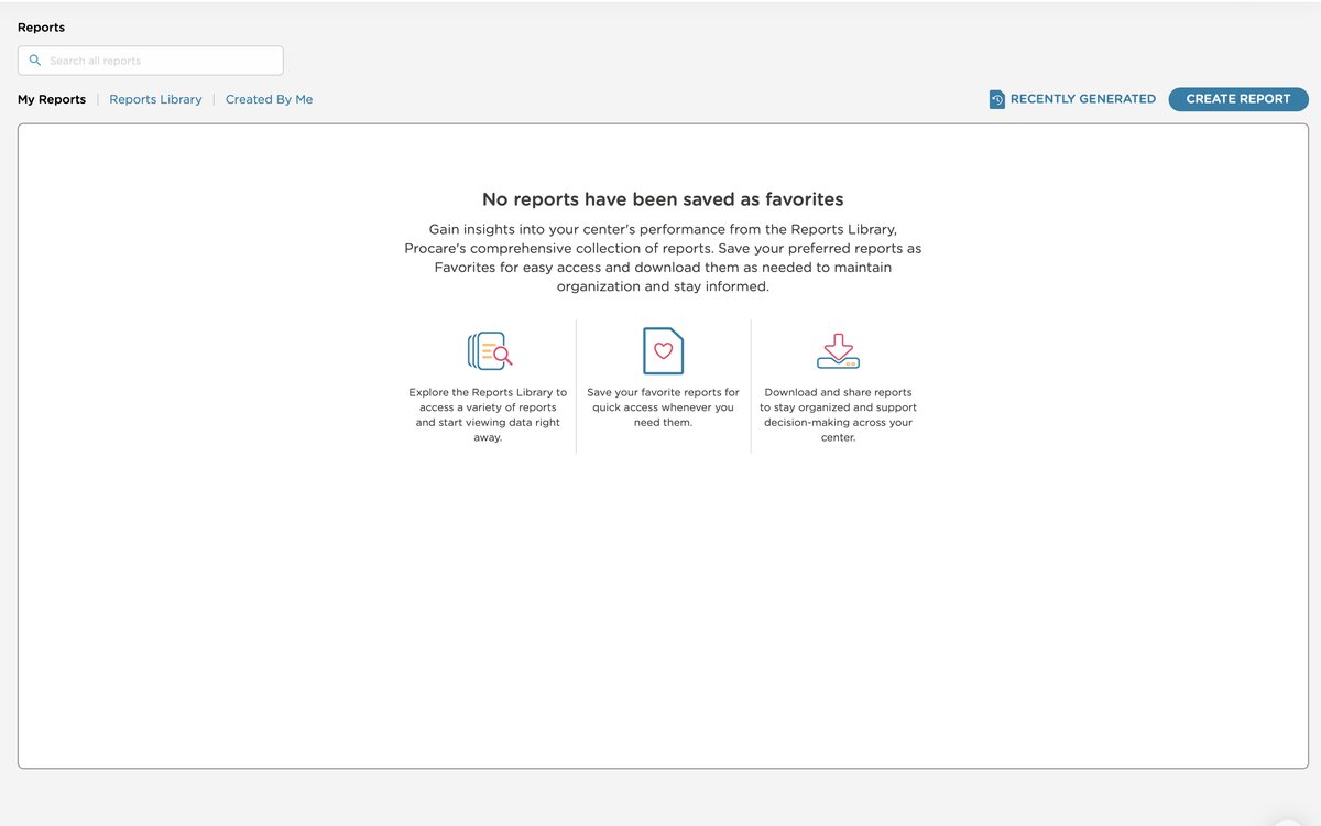 My Reports — empty state with onboarding
What I learned
This project changed how I operate.
A year-long project of this scope — built from scratch, phased, with real organizational complexity — will test you. This one did. I finished it, and it burned me out. But what came out the other side was a more grounded, more effective version of how I work.
Scope is a team agreement, not a suggestion. I got better at holding the line — keeping the whole team accountable to what we'd defined and documented together, and pushing back when "quick updates" turned out to be two weeks of work.
Discovery takes as long as it takes. I learned to teach that to PMs — that the time spent in research and user testing isn't a delay, it's what makes the build faster and more accurate.
Protect the edges of your day. Thirty minutes at the start to prepare, thirty at the end to close out. It sounds small. It made a significant difference to how I showed up for the work in between.
Advocate with confidence. When dev says something is too much work, it's worth repeating yourself. Speaking with clarity and conviction about why a design decision matters — for the user, not for aesthetics — is what earns you the room to make the right call. The team respects your role when you own it.
The platform didn't just get a new feature. It got a reason to be trusted.
The reporting section had been a source of friction for a long time. What shipped wasn't just a new UI — it was an answer to years of workarounds. Users who had built their own systems around the platform's limitations could finally stop. That's the outcome I'm most proud of.
Sales and implementation had been waiting for this for a long time. When the people closest to customers are excited about something you built, that's the signal that matters.