Rebuilding Procare’s neglected design system with Figma variables and Claude Design
A design system project refactoring inherited Figma components to use variables and bringing the library into Claude Design.
At a Glance
The problem
Prototypes in Claude Design never came out 1:1 with our UI. When I uploaded our component library, almost nothing came through except the foundation library items, which were built on variables.
The solution
I used Claude to map variables onto our components, then audited all 222 components, plus the page templates and brand illustrations, by hand. When the library later moved into Claude and parts of it broke, I caught the problems before handing it off and worked through about 60 fixes.
The response
I presented the finished design system to my design team, and the response was positive. What impressed them most was the manual audit I did of every component. My manager was also happy it was finally complete.
This project shows my ability to
- Trace a slow workflow back to its root cause (the components, not the prompts)
- Refactor and maintain a design system, not just use one
- Build a repeatable AI-assisted process, then check its output by hand
- Check my own work before handing it off, and finish the job when it falls short
- Take on the work no one else has time for, and finish it alongside other responsibilities
Project Overview
Procare Desktop is our 33-year-old legacy platform, and longtime, accounting-focused users love it. Developers build it with WinForms (Windows Forms) and DevExpress controls, and our design team keeps a matching UI library in Figma. When I switched teams, maintaining that library was a chore no one had time for, so I picked it up. Its components used hard-coded colors and had no saved spacing or text styles, so they didn’t carry into Claude Design, where we prototype and demo. I refactored them to use variables, tied them to the shared foundation library, and checked the result by hand. Later, when the library moved into Claude, much of that work came undone, and I found it and fixed it again.
What Was Broken
I started as a user of this design system, not its maintainer. I wanted to prototype in Claude Design, and what I found there sent me back into the library.
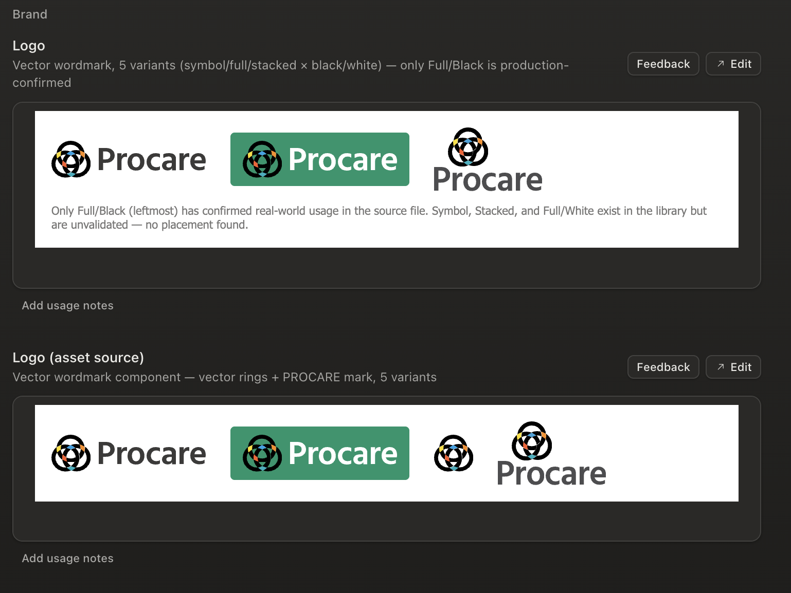
Prototyping from screenshots, then from the library
Neither Figma screens nor an uploaded library gave me a 1:1 match, and only the foundation components came through.
I first gave Claude Design Figma screens as inspiration and asked it to match our UI. It never came out 1:1, and fixing it took far too much time. So I exported a local copy of our UI library and uploaded it. Barely any components showed up, apart from the ones in the foundation library, which was already uploaded.
Those foundation components were already built on variables by the other design systems that use them. Ours weren’t. The difference had to be in how our components were built, so I went back to Figma.
Auditing the components in Figma
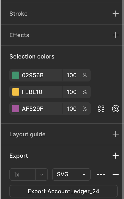
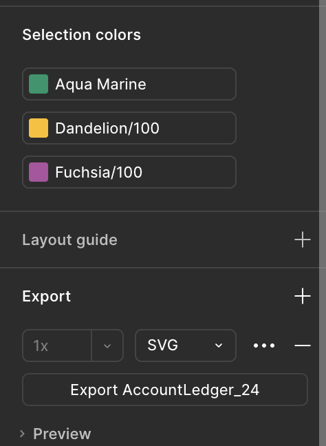
Our components used hard-coded hex colors, inconsistent colors, and no saved styles for spacing or text.
I went through the components and variables by hand. Colors were hard-coded as hex values, and they weren’t consistent from one component to the next. There were no saved styles for spacing or text either. Meanwhile the foundation library’s semantic colors and text styles sat unused.
The scale surprised me. I reviewed 222 components across five pages, all in one file: 144 icons, 67 controls and composites, and 11 supporting parts. Adding the page templates and brand illustrations, which I audited too, brings the total to 270. I left the templates out of the 222 because they’re built from those components.
What I took from it
The slow, never-quite-right prototypes weren’t a prompting problem. They were a component problem. So I stopped refining prompts and started fixing the components.
How I Fixed It
Rewiring components with Claude as an agent
I pasted my Figma link, and Claude worked inside the file to rewire each component to the foundation library’s variables.
With a library this size and other work on my plate, I had Claude do the mapping. Because Claude is connected to Figma, I could paste the file link and it worked as an agent inside the file. I added links to the desktop UI library and the new foundation library, then used prompts like this one:
“I’m taking components from an old design system and matching them with the semantic colors and text components in this new design system. Help me to rewire all the right colors, fonts, weights, tokens to recreate this component.”
Each component came back wired to the foundation library’s semantic colors and text styles, instead of hard-coded values. The Desktop UI library still documents Desktop’s own primitive colors, while the design system in Claude pulls the same colors from the foundation library that every product line shares.
Cleaning up stray links
A second pass made sure every component pointed only to the new foundation library or to a matching component in the same file.
Some components were still linked to other libraries after the first pass. I had Claude comb through each page and make sure nothing was linked to a different library, other than the new foundation library. Where a matching component already existed in the file, it used that one instead.
Checking every page myself
I reviewed all 222 components by hand, page by page, and audited the page templates and brand illustrations too, so nothing in the one large file slipped through.
Everything lived in one large file, so I reviewed each page myself to make sure nothing was missed. I didn’t want to trust the agent’s output without looking at it, and what I found next is why that was worth doing.
Teaching Claude what developers build
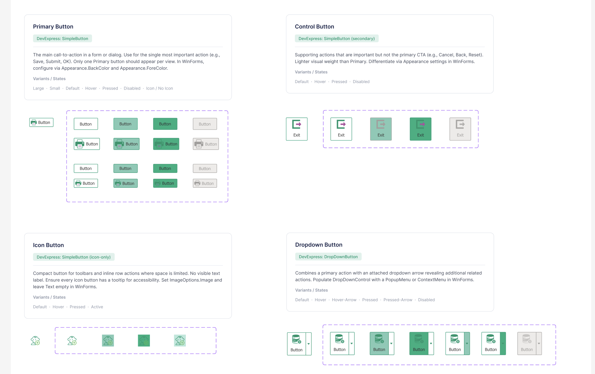
A developer-confirmed document tells Claude which WinForms or DevExpress control each component stands in for.
Matching the look wasn’t enough. Prototypes also needed to reflect the controls developers actually use. I wrote a document listing which WinForms or DevExpress control each component stands in for, had the developers confirm it, and gave it to Claude as context.
What still needed hand edits
After the first upload, icon buttons, menus, and input fields still needed fixes by hand.
The mapping wasn’t perfect, and I fixed these by hand:
- Buttons with icons didn’t fit the right width, and some had no background
- Icon placement was off on complex components like menus and input fields
- Some templates repeated words in their menus
Reorganizing the library
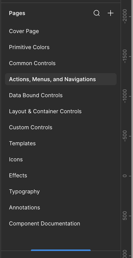
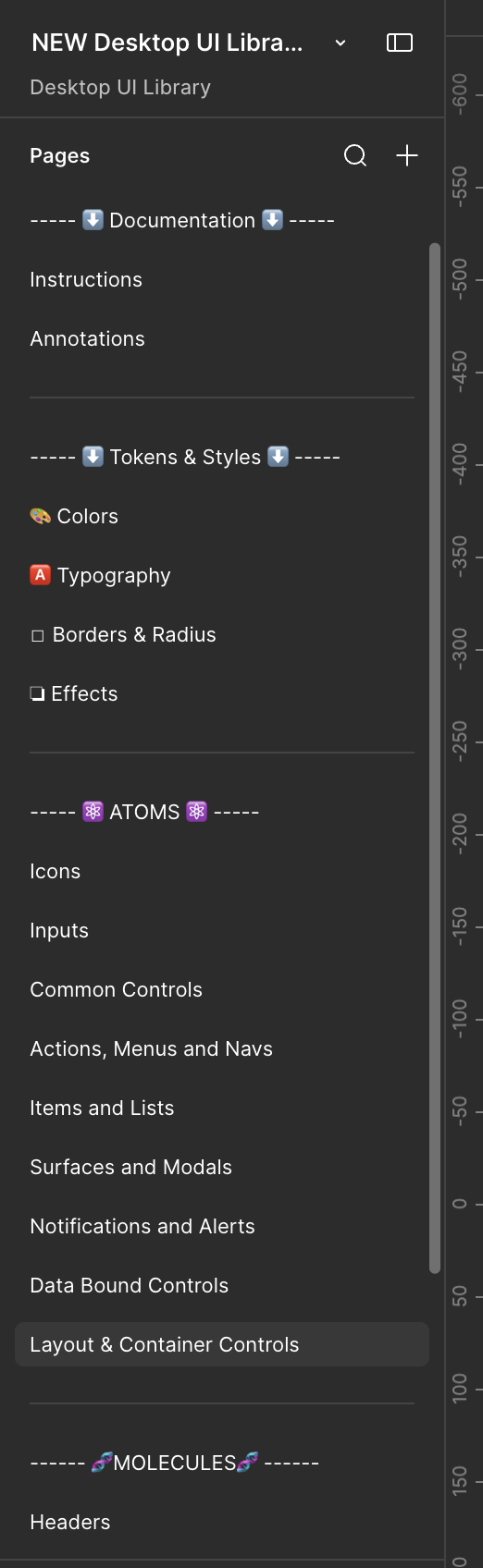
The inherited library was one flat list of pages, so I regrouped it into documentation, tokens and styles, atoms, and molecules.
The inherited file listed its pages in a single run, from the cover page through controls, templates, icons, effects, and typography. In the new version, the pages sit under four headings: Documentation, Tokens & Styles, Atoms, and Molecules.
I reorganized it so the format is consistent across all product lines. When designers switch teams, the library is easier to navigate because it’s laid out the way they already know.
What the Move Broke
I thought the project was finished. I’d completed the refactor and uploaded the library to Claude Design, then moved on to other work. About two weeks later, our design system moved from the standalone Claude Design site, which Anthropic is closing in December 2026, into Claude, where design systems are saved as artifacts (Anthropic’s migration guide). I expected the move to go smoothly, the way it was described.
When I asked our PM to try it out, I decided to double-check it first. That’s when I found what the move had undone. I found it a few days after the move, started fixing a few days after that, and finished about four days later, between other work.
What the move undid
The README pages came through incorrect, the icons stopped rendering, the file was too large, and the logos went back to their pre-refactor look.
I can’t say why this happened, so I won’t guess. Everything had looked fine until I went back through it page by page. This is what I found:
- The README pages were incorrect
- None of the icons would render
- The file was too large
- The logos had returned to how they looked before the refactor
About 60 fixes, one reference link at a time
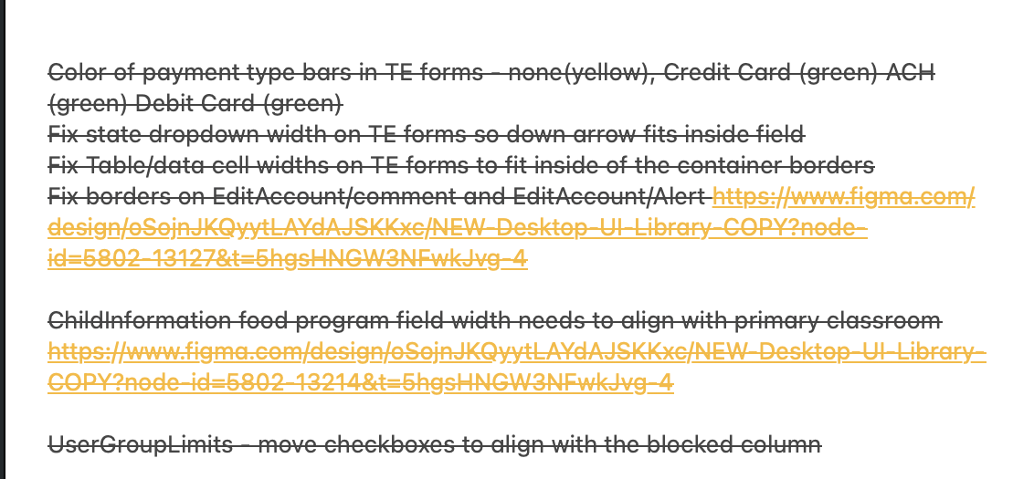
I worked through about 60 fixes by prompting Claude with a written fix and, where I had one, a link to the Figma reference.
I kept a running checklist and crossed each item off when it was done. The fixes fell into four groups:
- Type and color: fonts on buttons and dialogs, icon colors, and alert icons that needed to be red.
- Layout: forms too narrow for their components, table headers that wrapped, cells that didn’t line up with their headers, dropdown text that sat against the top of its button, and buttons that belonged at the bottom of a form.
- Missing pieces: templates for payment reconciliation, lead imports, reports, and MyProcare, plus the desktop application artwork.
- Behavior: checkboxes that couldn’t be checked or unchecked, so every form’s checkboxes now work.
- Naming: conventional design system names for component categories, alongside the Desktop-specific ones.
Before and after the final comb-through
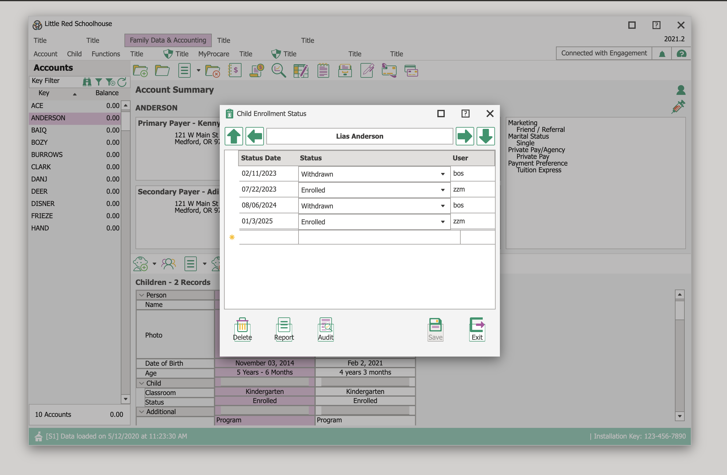
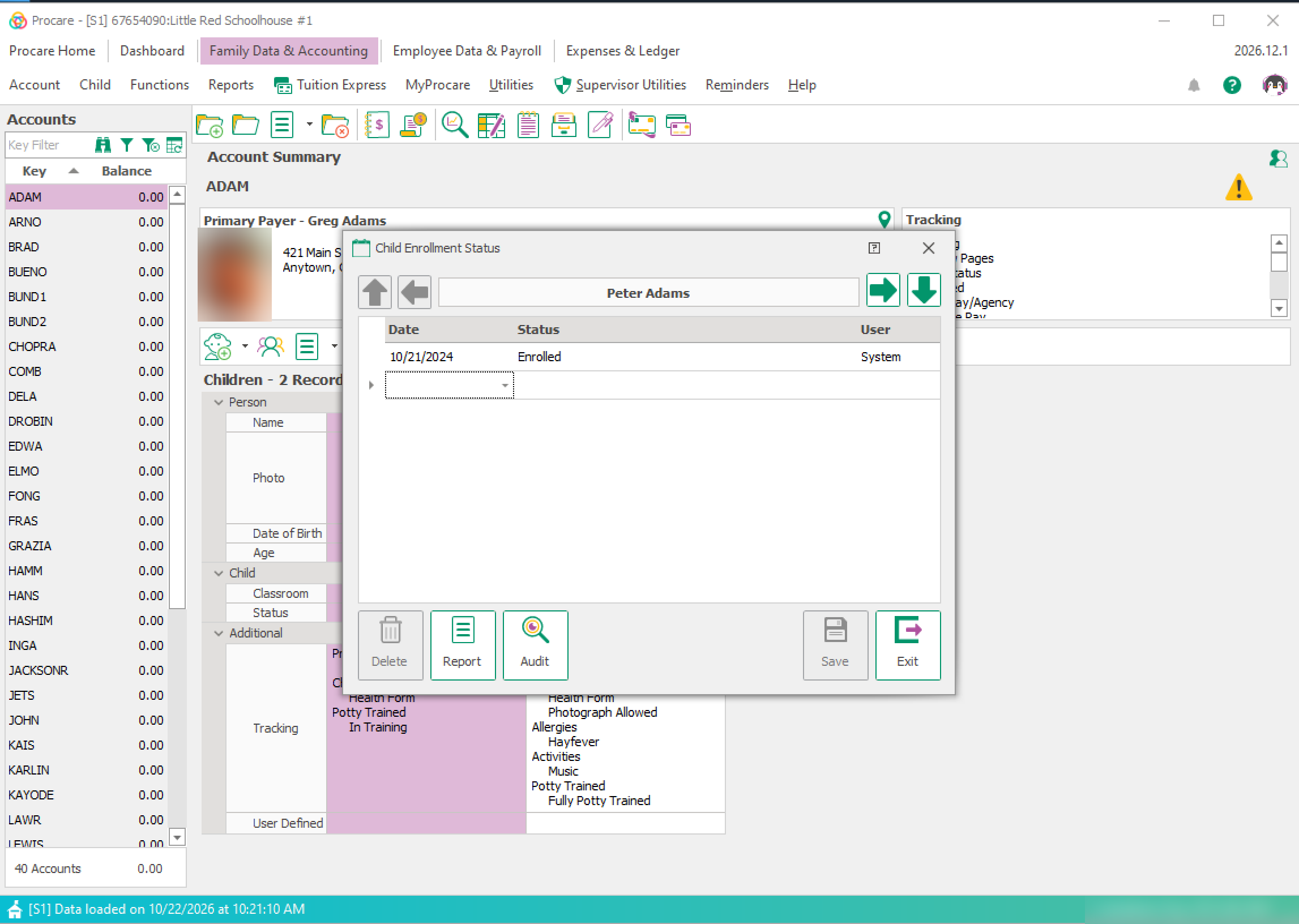
After the last pass, the tables and cells line up, and the icons now match the production app.
The first screen is Claude’s version before the final comb-through, with misaligned tables and cells. The second is the production app. After the refinements, the prototypes I make from the design system look the same as production, including the icons. Matching the icons was part of my audit.
What I took from it
I’d called it done too early. A move between tools is its own change, and it needs its own review. I took the extra time to rebuild the components, illustrations, and templates until they were right, instead of leaving the version I’d already called finished.
Where It Lives Now
After the fixes, the design system lives in Claude as an artifact, because Anthropic is closing the standalone Claude Design site in December 2026. Two libraries now run side by side. The Figma library stays the home for static, dev-ready screens, and a matching library in Claude handles rapid prototyping and demos. I’m its main user, and the PM has access too, so when a quick prototype is needed they can make one themselves.
Impact
I don’t have usage or time-saved numbers for this project, so this section rests on reactions and what the team can do now.
- Design team: After the fixes, I presented the finished design system to the team in a formal presentation in early November. The response was positive, and what impressed them most was the manual audit I did of every component. Earlier, before the library moved into Claude, I had walked them through the refactor in our weekly design review and got feedback and praise.
- Manager: Happy that it was finally complete, said before the library moved into Claude.
- Product: The PM can make quick prototypes without waiting on a designer.
- Prototyping: Claude Design now starts from our real components, so prototypes and demos are closer to the UI developers build.
Learnings
The prompt wasn’t the problem. The components were.
My first instinct was to prompt better. Then the upload came through with only foundation components, and that told me the cause was upstream. Now I check what a tool is being fed before I blame what it’s making.
AI did the mapping. I did the checking.
Claude rewired the components, and I still reviewed each page by hand. The icon buttons, menus, and input fields that needed fixing afterward are exactly the details that are easy to miss. When the library moved into Claude, checking again is what caught the rest. When I presented the system, the manual audit is what my team noticed most.
A design system needs a translation layer.
The developer-confirmed control document turned a library that looked right into one that reflects what actually gets built. That step is why the prototypes feel like the real product.
A finished project can come undone when it changes tools.
I’d called the design system done and moved on to other work. Then it moved into Claude, and when I went to hand it to our PM, I checked first and found broken icons, logos, and README pages. Now I review a migration like a new build, not a copy.