A UX/UI Designer. Artist
Wellness Application
UI Refresh Concept
The Problem: This app is a powerful tool that helps many, but its less than user-friendly UI leads to confusion and missed opportunities to fully utilize its features.
This is an app for managing eating disorders with meal tracking and support tools.
This project is a conceptual work and is not associated with or endorsed by this brand in any way. The name has been omitted.
Summary
Designed For:
All patients using the app
Make of the Team
1 UX designer
My Role
UX designer, UI designer
High level Timeline
Oct 2024 to Oct 2024
Methods Used
Design Thinking model, Object-Oriented UX (UXOO)
Prototyping and Research Tools
alignment diagrams,user flows, information architecture (IA), wireframes, clickable mockups, prototyping, conceptual walkthroughs, usability tests, Figma, Figjam.
BREAKING DOWN THE PROCESS
UNDERSTAND THE PROBLEM:
There is a need for a way for doctors and patients to track progress in overcoming challenges associated with eating disorders. The tool is used by various clinicians, reducing the amount of administrative paperwork required for treatment and providing patients with a private way to track and celebrate their progress. For such a popular application, the UI is surprisingly lackluster and outdated. Here is a quick walk through of the app's UI.
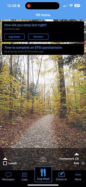

Wire frames documenting current states.
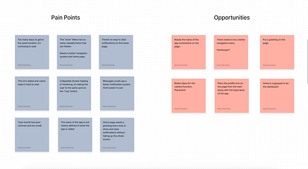
I did a site map and used OOUX methods to ensure I accounted for every page and feature of the application. It turns out that there was a lot of important items hidden away in the "more actions" button on the bottom navigation. These needed to be better organized and more accessible so that users can get the true and full value of the application. During this process is where many of the major pain points were captured.

FINDING A SOLUTION:
My first step was to research and create a mood board based on the UIs of other healthcare and wellness applications, to get a sense of common colors and design elements, such as whether illustrations were used or if the design was text-heavy. I chose my color palette from a beautiful image of a sunrise over a mountain range, which saved me time compared to using a color palette generator.

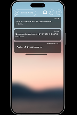
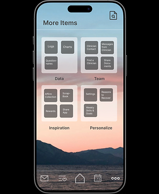
Once I had my color palette chosen, I based many of my design decisions on what would best complement the vibe of the photo. I opted for a clean, simple flat design with no illustrations, aiming to create a sense of serenity that suits the nature of the application. The large buttons make it easy for users to access the most frequently used features. I also brought the daily affirmation to the forefront, as it was previously buried in a long menu. It now scrolls horizontally, along with the user’s goals and reasons to recover—two other motivational items that were also hidden. Since these elements are meant to encourage users, I felt they should be visible and easily accessible.
Another issue were the notifications, currently they are taking up the entire screen and do not clear easily. I took a pattern from most mobile applications where the user can swipe up and down to view and clear them so they aren't constantly taking up the screen.
My main goal was to organize and bring out the invaluable resources that are hiding within the app due to the poor UI and information architecture.


PROTOTYPE
My prototypes are always done in Figma and you are welcome to play around with it Here.
CONCLUSION
This was the perfect example of how information architecture can affect the value of an application to its users. It's a step in UX/UI design that shouldn't be overlooked.