A UX/UI Designer. Artist
Custom Dashboard for Shared Services
The Problem: Our Shared Services users lacked a straightforward method to track and monitor business operations across the numerous childcare centers they manage, aiming to ensure business health in comparison to a defined benchmark. In cases where the center's performance dips below the benchmark, the shared service administrator lacks a convenient means to track the situation and determine the appropriate intervention timing. We made the decision to develop a dashboard featuring interactive data visualizations.
A concise, graphical interface for showcasing business operations.
Summary
Designed For:
Procare Client – Shared services allegiance for childcare centers
Make of the Team
1 UX designer, Dev team (1 FE AND 2 BE)
My Role
UX designer, UI designer, User Interviewer.
Collaborated with UX Researcher and UX Writer
High level Timeline
Jan 2023 to May 2023
Methods Used
Design Thinking model. User interviews, alignment diagrams, personas, scenarios, user flows, IA, sketches, wireframes, clickable mockups, prototyping, conceptual walkthroughs, usability tests, internal design reviews.
Designed For:
Procare Client – Shared services allegiance for childcare centers
Prototyping and Research Tools
Figma, Figjam, Great Question
BREAKING DOWN THE PROCESS
UNDERSTAND:
Our company informed my team that a feature had been sold to potential customers who were keen on utilizing our software for a shared service provider. However, the challenge lies in the fact that this feature hasn't been developed yet. Our task was to construct this feature to uphold our commitment and deliver substantial value to our customers.
EMPATHIZE-RESEARCH:
With the help of our UX Researcher, I reached out to our in-house subject matter expert in shared services to gain invaluable insights into the unique needs of our new customer base concerning our product. Our strategy encompassed conducting two interviews with the subject matter expert and conducting additional independent research to ensure a thorough understanding of the audience I was tailoring my design for.
Initially, unclear data requirements and purposes posed a challenge for starting a visualization. Realizing this, the UX researcher and I planned more user interviews with shared service clients to identify their pain points and find actionable solutions.
“We would rather see the profitability of an entire school. Our center’s think about how they can maximize space and revenue, but this talk is more in theory at the moment”
DEFINE:
I chose to use affinity mapping to make sense of the insights and pain points stated by the shared service coaches and decipher what information or data they would like to see and how would they ideally like to see it presented. I wanted to see what the commonalities were, so I knew what to include in the design.
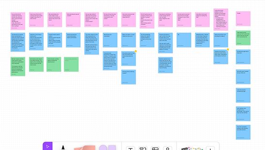

Designing this was challenging due to existing customer expectations from a preliminary mockup by another designer. It was clear that data visualizations were necessary and best suited for a dashboard layout. We started with one data visualization as the data was readily available through our software. However, we aimed to innovate and develop something distinct that would offer enhanced value to our customers.
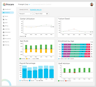
Shown is the proposed finished product mockup
What defines a Shared Services Provider, and what unique requirements did they have for our software that couldn't be met elsewhere?
We ultimately learned that a shared service provider (SSP) is a unit within a company that combines and centralizes certain business functions to serve various departments, aiming to boost efficiency, cut costs, and improve service quality through standardized and streamlined processes. Our users needed a simple way to oversee and track business operations across multiple childcare centers they oversee. The goal was to ensure business health compared to a set benchmark. However, when a center's performance falls below this benchmark, the shared service administrator faces challenges in tracking the situation and determining the right time for intervention.
“We tied to use [another accounting software] for tracking costs but it was a terrible experience, none of our information transferred into Procare, making it useless to us” – Shared Service Provider
I typically like to start with my personas and put myself in their shoes while doing the customer Journey map so that I won’t miss any possible flows that need to be documented and their potential pain points. From there, I write my different scenarios.
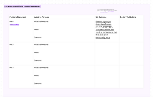
I have found our optimal working method: I start with a collaborative meeting to review information and objectives. Then, I work independently for a few hours to explore ideas at my own pace. After this, I reconvene to share my findings, fostering a creative environment. Once the problem statements are defined, I create measurable UX outcomes by completing a table like the one below.

"I love to take my time uninterrupted to jot down any and everything that comes to my mind. You never know what could lead the team towards the right solution."
IDEATE:
During a formal ideation session, we generated "How Might We" questions (HMWs) to prompt innovative thinking. This naturally progressed into a comprehensive discussion on the functional aspects of the interactive data visualization. We analyzed the required components and delved into conceptualizing an ideal user flow for a seamless user experience.
To begin the project, I created basic wireframes using a whiteboarding tool instead of sketching by hand. This approach helped me articulate ideas clearly and make notes throughout the process, addressing key questions. As I iterated on the design, I aimed to evolve it progressively from the initial mockup for a more distinctive outcome. I then presented the wireframes to our developers to validate the feasibility of implementing the interactive graph, ensuring alignment before moving forward.
I prefer using digital whiteboarding tools because they enable everyone to contribute notes and voice their concerns. Given that our developers are distributed across the globe, this allows them to review the designs at their convenience during their work hours.


Additionally, I conducted an extensive review of the existing web portal, searching for any established design patterns that could serve as a model for the new feature. Even though this feature was entirely novel, it was imperative that it seamlessly integrated with the brand's existing identity.

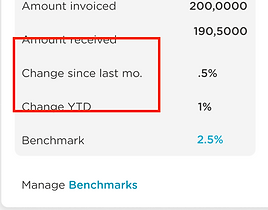
Existing pattern for modeling.
After identifying a pattern in another section of the portal that included data visualizations, I delved into the specifics of designing the dashboard and defining user interactions with the interactive elements.
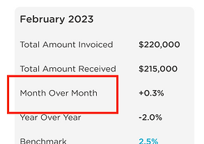
New Pattern
PROTOTYPE
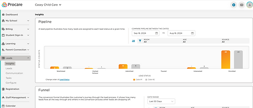
The final solution was an interactive dashboard that empowers users to effortlessly explore and track trends across schools during a specified time frame. Users have control over essential settings, enabling them to customize information for each school. Initially, we opted to begin with one visualization, with plans to incorporate additional ones in the future.

-
The search allows you to find a school out of thousands without having to deal with “the endless scroll,” Just type in a few letters and selections will appear in the drop down.
-
There is an option to view data for the last 3,6, or 12 months counting back from a selected month.
-
The current month and year will be the default.
-
The blue number on the Benchmark line is editable.
-
Once edited, the dotted benchmark line will shift on the graph accordingly.
-
Clicking on a data point on the graph will cause the information in the grey box to change to display the data for that specific month.
Once we had the design pattern in place, a clear understanding of the information presentation and dynamic elements, I created multiple prototypes for internal testing with the product manager and developers. Multiple design reviews with the design team resulted in 3-4 iterations. We were nearly ready for user testing when a request for an additional feature came from an ELT member. Despite the expanded scope and time constraints, I quickly added another screen to address the request. This was a challenge as our design validation meetings with SMEs and other departments were already scheduled.
[Link to Prototype] Try it out Here!
I find it beneficial to create distinct branches in Figma for various purposes. I maintain one for designs in progress, another for design validation, and one more for usability tests. This separation helps keep everything organized, making it easier to track changes and comments on the relevant documents within the app.

Validate
The design validation day was tense, especially with the ELT present. I ensured the high-fidelity prototype was flawless and performed as intended. Although the feedback was disheartening, likely due to their attachment to old designs, I carefully distinguished between constructive insights and personal opinions.
After minor adjustments, I determined that the best validation would come from shared service coaches. With our UX Researcher, we arranged formal usability tests. Though they could use the feature, concerns about naming conventions persisted.
Their feedback was invaluable, leading to planned A/B testing to refine labels. I collaborated with our UX Writer to clarify financial terms, ensuring accuracy and meeting users' needs, which was critical to the feature's success.


Lastly, I want to emphasize the developer handoff process. While different teams have their preferred approaches, I find that the method in Figma I've described is the most straightforward and effective for our workflow.
-
Create finalized design file labeled like so, Project name/Subject of File. Ex. Project Name/Alignment Diagrams, so that everyone knows which file they’re viewing.
-
Create branch titled “Dev Handoff.”
-
Within that branch I have two pages:
-
one with the working prototype for QA
-
one page with screens built out for our front-end developer.
-
-
Lastly take the link to the Figma file and deliver to the PM to writes user stories.
My Developers have agreed that this method works best for them and each one gets the designs tailored to the purpose of their job. Our Front End isn’t always necessarily interested in the prototype when coding.
LEARNINGS
-
Designing by commity can lead to a design disaster. While people often share their design opinions, it's essential to sift through feedback and prioritize what aligns with your vision and objectives. Politely acknowledging with "Thank you for the feedback" doesn't obligate you to implement every suggestion. Trusting your judgment is essential.
-
Becoming overly attached to a design can prevent you from recognizing its flaws or hinder necessary changes. Remaining open to revisions, even scrapping designs when necessary, is part of the process. Adaptability is key in the world of design!
-
More research is always a good investment. It's wiser to gather excess information than fall short. Conduct research autonomously, even if UX research isn't your primary role.
-
Creating a brand-new feature is a challenging endeavor, different from enhancing existing ones. It's a blend of creativity and structure since you're laying the groundwork for future work by others.
-
While grayscale may seem less distracting, it can still confuse users. Revealing high-fidelity designs too soon can be a tricky move. However, making these rookie mistakes is all part of the learning process!